Saturday, October 2, 2010

In Class Exercise ( Bathtub )

We got the word Bathtub and we had to come up with some images to provoke feelings ... The more provocative the better, shock and awe is the key! So we grouped into teams and everybody had a go at bringing their point across, very unproductive because each person had their own creative idea and it was hard to come to a consensus ... So we just appointed 2 people with good photoshop skills and let them take over :D


Erm knives sticking out of the bathtub, the concept is a bathtub is a place of comfort, so we're showing the reverse of pain, suffering, get mutilated while taking a bath. Boiling water to boot, but the steam is hard to create in 5 mins so it kinda looks like snow :D I would have added a few bloodstains here and there in lieu with the slasher flicks that always do their murdering in the bathtub lol


Concept of a bathtub uses so much water to satisfy the owner that it becomes very eco-unfriendly, so theres a drought around it while the bathtub inside is all sunshine and good times. Concept wise it is realistic and feasible, but not very provocative in the end. Not enough sex/blood/violence ><

In Class Exercise ( Lighting )


Couple of in class photos of lighting that we are suppose to explore around with. Lighting to the back/sides/top , playing around with white balance and reflectors, everybody clamoring around to take photos of the 1 aspiring model of our class :D

Appropriation??

So theres this assignment where we're suppose to ripoff other people's work and edit it to suit our own taste ... This reminded me of a previous assignment I did before and I did not submit it for my final portfolio because of copyright issues ... Perfect chance to blow off the dust!


I'm a serious World Of Warcraft junkie ( meaning when Cataclysm comes I'll wet my pants ) so I embarked on a mini project to make a poster for WoW ...

Made entirely from actual game screenshots, which explains the horrible cropping lol ... It's a bit outdated since this is expansion 2 and we're already near the tail end of expansion 3 but Burning Crusade was where I spiraled into the realm of WoW addiction so this kind of pays homage to it :D

This design had been stuck in my brain for quite some time, finally I got the time to mess around with it. "Save Azeroth" has the familiar in-game font that's horrible to read on your mail. Huge Horde logo on the right to show my faction of choice. Middle is the Dark Portal, which is central to the storyline plus it looks kickass. I wanted to give it an invasion look , so I got many different characters in a nice semi circle shape at the bottom , all eyes on the poor nightelf in the centre. Nightelf = Alliance = Not Horde = In Trouble.

It's a bit bottom heavy given the mashup of colourful characters but I think I achieved the "greatness of numbers" look. You know, when you watch Lord of the Rings and see 1000000000 soldiers on screen and go "OMFG..." ? Smaller scale here but same effect. The colour is pretty contrasting , overall colour combination came out well. Could use a bigger border though ...

For the Horde!

Low Key


Its a demon coming at you! Actually its just Charizard , remember Pokemon? The original toy figure is looking up to the sky ( most probably to breath fire ) so I stuck the figure on a box and slanted it towards my camera ... My bro held torchlights around it to create lighting.


Not really sure what I was trying to do here, I guess I just wanted to take a nice dark photo using a Gundam model ... I love the look of the weapon though :D I think I was trying to get the feel of a frontal portrait with half of the Gundam in the darkness but the shadows casted by the weapon was a hindrance, so I shifted to the side.

High Key


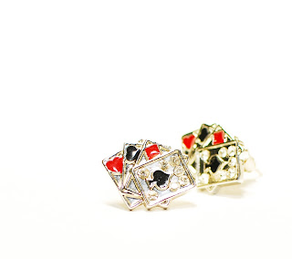
Bought this pair of unique and eye catching ear studs from USA not long ago, brought me quite a lot of luck when gambling with my fellow Work And Travel mates so I figured it would make a nice high key subject ... Not sure why the one behind turned out yellowish because its suppose to be out of focus

Zoom shot


So the story goes, I was taking the MTR in Hong Kong and trying out some zoom shots at random objects and my pair of Sanuks was the best object around to hone my technique ... Lo' and behold, a passenger suddenly stood right in front of me, his back turned ... Opportunity knocks but once ...


FREAKING COOL LA!

Close Up


Different perspectives of my favourite item in the house ... the dumbbell! Tried to find an obscure angle to mask its identity, but the 2 plates of weights are so freaking obvious that I gave up lol

Motion Blur


Speeding trams you find in Hong Kong, I didnt have a tripod with me at that time so the background is slightly blur but the lights give it a nice speeding effect ( even though they were moving at normal pace )

Deep Depth o Field

Got a lot of things to upload, so ill take it step by step ... First off, assignment 2 Deep Depth of Field.


Both taken when I went to Hong Kong during the recess week, scenery of The Peak ... Subject is freaking far away, so I think it qualifies as deep depth of field :D